


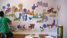
These are examples by “
Always with Honor”. Elsa and Tyler are former ringling grads and are doing some fresh work. These projects demonstrate how to think of a cohesive visual system. The systems here include flat and simplified to complex and dimensional. The final example brings in an element of texture. Think of how an alphabetic system works with a limited number of strokes: straight, curve, straight/curve, diagonal. Details need to be considered too. Are the lines ending with square or round ends? Remove all parts that are not necessary and only include the parts that give the form its essence.
Graphic systems:
share a simple language of line
positive and negative shape
details to mass
color


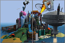
 Each piece on the globe attaches with magnets. The interchangeable system allows complete freedom to customize your vision of the world. Includes water, terrain, factories, tanks, houses, skyskrapers, trees whole and cut, and dinosaurs.


 Emily's visit to a family owned tree farm inspired her to explain sustainable logging–people, processes, and products.


 Ximena designed a project where each flower on the tree represents an emotion. The flowers are picked and read like a small book. Each tells a story.


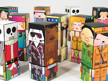
 Jordan designed a game called “mini nation”. The conflict is between government and business owners.
 Valentina Designed a series of nesting boxes encouraging introspection and self reflection.


 Nicole’s project was posted on Strictly Paper. She combined her love of fashion, photography and paper into compelling images. Her inspiration was animal skins, horns, and claws.


